BRAND
PORTFOLIO
Every brand has its own story, personality and purpose.
Over the years I’ve had the privilege of working with a diverse range of independent businesses, from hospitality and events to lifestyle and service-led brands.
From full brand identities and website builds to social media content, print design and event branding, each project reflects a tailored creative approach designed to bring clarity, cohesion and impact.
This portfolio is a small selection of the work created in collaboration with the brilliant businesses I’ve been lucky enough to work with.
FLYING FILLET
Full Brand Development
Flying Fillet began as a vision from founder Tristan: bold food, big personality, and a street food brand that would stand out in a busy festival and events scene. Together we transformed that vision into a vibrant, recognisable brand identity.
The branding was built around energetic colours and playful design elements to reflect Flying Fillet’s cheeky charm, bold, confident and just on the edge of being a little bit naughty.
Since the initial brand creation, I have worked closely with the business across a full range of design and marketing touchpoints. This has included a complete website build, ongoing social media content, branded event kit, menus, merchandise and uniforms. Most recently, the brand has been brought to life even further through the design and development of their custom event trailer.
Flying Fillet continues to grow as a strong, recognisable presence across festivals and events, with a brand that is as bold and memorable as the food itself.


BUBBLES & SQUEAK WELLNESS
Brand Refresh
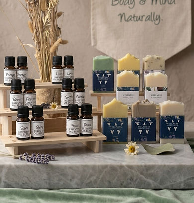
Bubbles & Squeak Wellness came to me as an established brand looking for a fresh visual direction while still preserving the heart of what made the business special. The aim was to refine and elevate the existing identity without losing the warmth and authenticity that customers already loved.
Through a thoughtful brand refresh, I developed an updated visual identity that felt cleaner, more cohesive and aligned with the brand’s natural, wellness-led ethos.
Alongside the refreshed branding, I designed a range of packaging across their product line, including soaps, bath salts and face masks. The designs were created to feel calm, natural and beautifully considered, ensuring the products not only work well but also look striking both online and on the shelf.
The result is a refined brand that honours its original foundations while presenting a more polished and cohesive identity moving forward.




PIGGY PUDS
Full Brand Development
Piggy Puds was born from Sam and Bob’s shared love of baking and a legacy nickname from Bob’s time as a butcher, where he was fondly known as “Piggy Bob.” From this story, we created a brand that celebrates personality, humour and indulgent treats in equal measure.
The visual identity was built around vibrant pink tones and playful design elements to reflect the brand’s bold, cheeky charm, creating something instantly recognisable in busy festival and events environments.
Since developing the brand, I have worked closely with Piggy Puds across a wide range of design and marketing touchpoints. This has included a full website build, ongoing social media content, branded event kit, menus and merchandise, ensuring the brand feels cohesive both online and on the ground at festivals and events.
Piggy Puds continues to grow as a fun, vibrant presence in the street food and events scene, with branding that captures the warmth and personality behind the business.


Gallop & Grace Racing Club
Logo, Leaflets & Web Design
Some briefs arrive with a story already woven through them. Gallop and Grace was one of those.
At the heart of this racing club is Valda. A three year old filly named in honour of Tina's late mother, Valda Pamela. A woman who lived 93 remarkable years with sharp wit, a warm heart and a wicked sense of humour. A businesswoman, a community cornerstone, a musician, a gardener and by all accounts, the life and soul of every room she walked into.
A brand built around that kind of legacy deserves to carry itself with the same grace.
The brief was clean and clear. Racing green, off white accents, simple, elegant and timeless. Nothing overdone. Nothing that would date. A brand that felt as at home on a race day leaflet as it did on a website or a social feed.
The logo needed to do a lot of quietly. It had to speak to the tradition of British horse racing while feeling fresh enough to attract a new generation of syndicate members. Classic typography, considered spacing, nothing fussy.
From there the identity rolled out across print collateral, a full website build and an ongoing social media presence, all held together by that same restrained palette and the sense that this is a club with real substance behind it.
Gallop and Grace isn't just a racing club. It's a tribute. And every design decision was made with that in mind.
PizzaMo
Logo, Banner & Menu
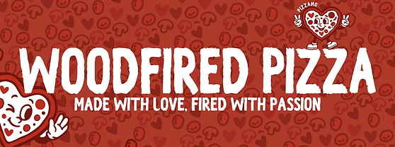
Mo came to me with a vision, a colour palette and an existing visual he wanted to replicate. Red, white, bold and eye catching. Simple enough on paper.
But there was something that wasn't quite landing and I couldn't in good conscience recreate someone else's work. So instead I did what I always do. I went back to the beginning and asked what this brand is actually about.
The name held everything. Amo means love in both Spanish and Portuguese. Mo is the owner. Put them together and you don't just have a pizza brand, you have a love letter to pizza from the person who makes it.
That single idea unlocked the whole identity. Love gave us the heart. The heart became the logo. A cheeky, characterful little face full of warmth and personality, sitting at the centre of a brand that feels handmade, joyful and completely impossible to walk past without smiling.
The deep red runs through everything, bold and unapologetic. The typography is loud without shouting. And the tagline, "made with love, fired with passion," writes itself when you understand what the brand is really saying.
This is what I mean when I say I get to the core of a brand. Mo didn't just get a logo. He got an identity that tells his story every time someone sees it.



Grain and Gloss
Brand Identity, Print and Social Media Setup
Every tradesperson faces the same challenge. The work speaks for itself but getting in front of the right people is a different skill entirely. When Ben came to me with Grain and Gloss, that was exactly where we started.
But Ben wasn't just looking for a logo. He was looking for something he was genuinely proud to wear.
Ben takes his box fresh trainers seriously. He knows his graphic tees. Style is part of who he is and he wanted his brand to reflect that. Not a standard decorator's uniform with a name on the chest. Something cool enough to actually want to put on in the morning.
So the character at the heart of the brand had to have real personality. Had to have the right trainers. Had to be the kind of illustration you'd want on a tee.
The result is a hammer and paintbrush duo with attitude. Cheeky without being unprofessional, cool without trying too hard. The olive green palette is warm and grounded, a little different from the usual trade blues and blacks, and the tagline "nailing it, one coat at a time" says everything it needs to say in six words.
With a sole trader, the person and the brand are the same thing. Ben's brand makes sure that comes through from the very first impression.
Worcester based and proud of it.